

Rink Rivals
Brand
Rink Rivals is a competitive NHL 27 EASHL 6v6 league. The look is broadcast-led: a dark navy base, one cyan accent doing most of the work with red as the pop, square corners with a notched panel, and three strict type tiers — Akira for main headers only, Evogria for labels, names and numbers, Roboto for everything else.
Everything on this page is served as JSON — CORS-open, no key.
The Palette
Broadcast (dark) is the site and every graphic. Ice (light) exists only for the light background. Each swatch shows both — dark on the left.
Page and canvas background. Every graphic starts here.
Card and panel surface, one step lighter than the page.
Panel header strip over the panel surface.
Selects, inputs and search fields. Pair with line-strong.
Search-match fill, with a 1px inset cyan ring at 50%.
Hairlines and dividers — the rule beside an eyebrow, panel edges, row separators.
Control borders and the outline button at rest. Focus is cyan at 60%.
The zero-centre tick of a diff bar.
Body text and stat values. 15.6:1 on dark, 18:1 on Ice.
Secondary text — eyebrows, subtitles, table headers. 6.2:1 on dark.
Idle chips and tabs, empty states. The contrast floor (4.5:1) — never under 10px.
Text on any cyan fill. Always black, never white.
PRIMARY accent — links, active chips, tab underlines, value bars, the accented title word. On Ice it is a fill or 40px+ display text only (2.1:1 on white).
Hover state for the primary accent.
SECONDARY accent, the pop — top rank badge, losses, alerts. On dark use at 24px+ or as a fill (3.7:1 as text).
The disc behind the Rink Rivals mark, when placing it on a tinted ground.
Text selection background, with ink-on-accent as the selected text.
Semantic only. Win indicators, as a fill with black text. Never decorative.
Semantic only. Overtime losses, as a fill with black text. Never decorative.
Loss indicators — the brand red reused, not a separate red.
Type Tiers
Every specimen below is set in its own face at its real size.
@font-face { font-family: "Akira"; src: url("https://www.rinkrivals.com/Akira.woff2") format("woff2"); font-weight: 400; }
@font-face { font-family: "Evogria"; src: url("https://www.rinkrivals.com/evogria.woff2") format("woff2"); font-weight: 400; }Page hero title. Accent the second word in cyan or the entity colour.
Section titles, team names in matchup cards.
Panel head titles. A main header: the last place Akira appears.
The badge before a title, column headers, rank numbers.
Eyebrow beside its badge and hairline, uppercase, in muted ink.
Tab labels. Active in cyan over a 2px cyan underline.
Filter chips and button labels.
Short lines on graphics and cards. Never bold.
Meta lines and sub-labels in muted ink.
Stat values in rows and cells. Always tabular figures.
Featured numbers — the top cell value, hero stats.
Scores on full-size graphics.
Rating badge value only — 10px xs, 12px sm, 14px md. The one place bold is allowed.
Paragraphs, rules and explanatory copy — anything that is not a header, a name or a number.
- Three tiers, strictly: Akira for main headers only (page, section and panel titles), Evogria for labels, names, numbers, pills and buttons, Roboto for everything else.
- Never bold Evogria — it has no bold face and the synthesised weight looks wrong. Emphasise with size or colour.
- Evogria runs narrower than Akira. When swapping Akira for Evogria, bump the size about 2px.
- Always use tabular figures for numbers so columns line up.
- Labels are Evogria, uppercase, 12–13px, tracked 0.025–0.2em, in ink at 45–55%. Never Akira: if it is not a page, section or panel title, it is not a header.
- Pills are Evogria on one shared box — 18px, 20px or 24px tall. Never hand-roll a pill.
- The one place bold is allowed is the rating badge value, which is mono.
Shape & Space
The notched panel — a 16px cut, top right. Every card carries it.
- Square corners everywhere. No rounded corners on panels, buttons, chips, inputs or images.
- Panels carry a notched top-right corner, 16px: clip-path: polygon(0 0, calc(100% - 16px) 0, 100% 16px, 100% 100%, 0 100%).
- Circles are only for avatars, headshots, form dots and the spotlight orbs.
- No left accent bars — use colour or an icon instead.
- Panel depth is one shadow: 0 24px 70px -24px rgba(0,0,0,0.85). Chips, tabs, buttons and badges carry none.
Broadcast Look
The on-air language: a carbon weave on navy, and a team colour lit from above that fades to navy.
background:
  repeating-linear-gradient(45deg, rgba(0,0,0,.16) 0 1px, transparent 1px 3px),
  repeating-linear-gradient(-45deg, rgba(255,255,255,.04) 0 1px, transparent 1px 3px),
  linear-gradient(180deg, rgba(255,255,255,.06) 0%, rgba(255,255,255,0) 40%),
  linear-gradient(180deg, #0a1c28, #06131c);
background:
  repeating-linear-gradient(45deg, rgba(0,0,0,.16) 0 1px, transparent 1px 3px),
  linear-gradient(180deg, rgba(255,255,255,.18) 0%, rgba(255,255,255,.03) 48%, rgba(0,0,0,.24) 100%),
  linear-gradient(90deg, rgba(6,19,28,0) 0%, rgba(6,19,28,.55) 55%, rgba(6,19,28,.92) 100%),
  var(--team);
- Two surfaces carry everything on air: a carbon weave on navy, and a team colour lit from above that fades to navy across the row.
- Never use color-mix(). OBS’s browser source predates it and the colour silently drops out on air — compute lighter and deeper shades from the hex before rendering.
- The crest sits on a deeper tile of the team colour with a slanted right edge. Never crop a crest and never show it twice.
- Numbers are Evogria, white, tabular. A score sits on a darker cell of the row.
- Pills are flat and square with no border. One highlighted pill may take the team’s light shade with navy text.
- Entrances wipe in from the left with a light streak; big words flip up letter by letter; numbers roll like an odometer. Nothing flashes the whole screen white.
1920 × 1080
1920 x 1080 on bg-page, with a 64px safe margin on all sides. Nothing but bleed imagery crosses it.
- 1Header row, y 64–200: the code badge (cyan fill, black text), then the eyebrow label in muted ink, then a hairline to the right edge of the safe area.
- 2Hero title under it at 96–120px, leading 0.85, uppercase, two lines at most, the second word in cyan or the entity colour. Left aligned at x 64.
- 3The crest sits top-right in the header band at 170px, bottom-aligned with the title, a subtitle in muted ink to its left. On an entity graphic the team logo takes that spot and the crest drops to the footer at 80px.
- 4Content zone, y 240–980: a 12-column grid with 24px gutters inside the safe area.
- 5Every block is a panel — panel surface, the 16px notch, the panel shadow, with a head strip on top. Cells inside a panel take a 1px cyan border at 22% over a 110° cyan wash fading out by 72%.
- 6Footer, 40px off the bottom: the site, the rules page and the stream, in Akira at 16px, 0.12em tracking, white at 45%.
- 7Leaderboard rows are 56px tall: rank left, name at 20px, value right-aligned, a value bar behind scaled to the leader. Row one is the featured cell with the red rank badge.
- 8Matchup: two columns, each logo at 200px, name in title, record in caption, the score between them at 96–140px. The winner takes the featured-cell treatment in their own colour.
- One red element per graphic. Cyan carries the rest.
- Use the entity colour for a team or player graphic, exactly as their page does.
- Never round anything, never add left accent bars, never stack gradients, never use emoji.
Don’ts
- No accent colours outside the palette — no emerald, yellow, slate, purple or default framework accents.
- Green and orange are semantic only (win, overtime loss). Never decorative.
- No rounded corners on structural UI.
- No left accent bars.
- No glassmorphism gradient header bars, and no busy multi-stop gradients.
- Never bold Evogria.
- Never use a player’s Discord avatar as their picture — use their photo-day headshot, or a silhouette.
- Don’t set red as small text on navy; it fails contrast.
Assets
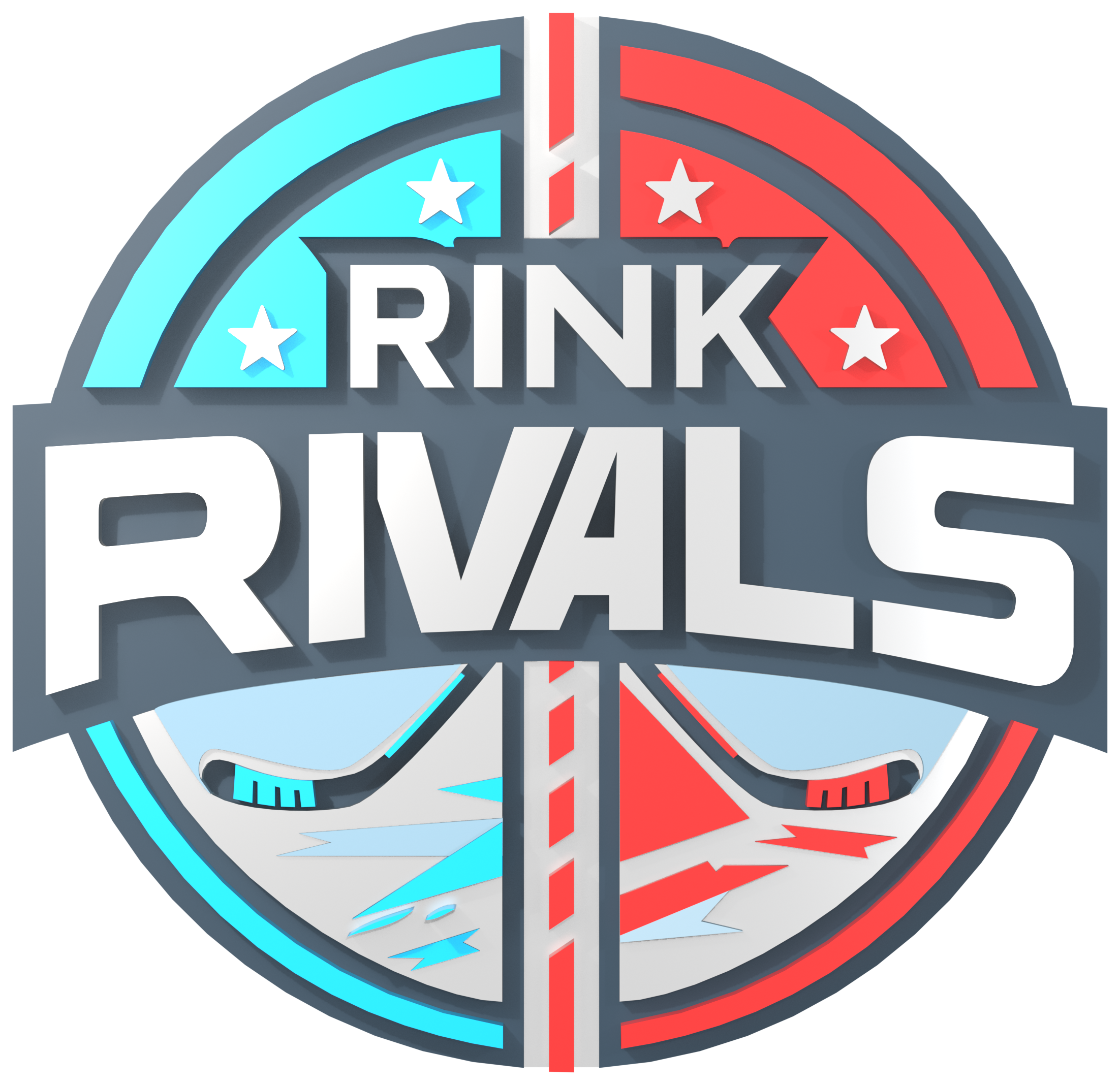


The Rink Rivals name, crest and wordmark are owned by Rink Rivals. Use them to refer to or represent the league accurately. Do not alter the crest, imply endorsement, or use the marks for another organisation.